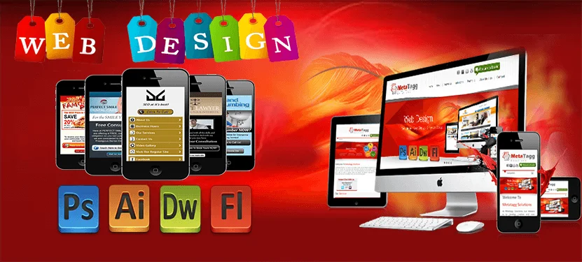
Web design user interfaces are much more than buttons, icons, labels, menus and forms for users to fill out. They are the connection between the user and the experience; the first impression and a lasting impression that either makes a website feel like an old friend .show we provide all facility in then user are understand proper meaning of website design.
Many automated solutions exist to make UI web design simpler, high and faster; however, the designer must understand some basic rules of how to web design a user interface. Because the focus is centered on the potential user, the user’s needs must primarily drive all design choices. But we are also provide user interface a web design. Show bellow some points includes in user interface web design
Use Tooltips and Integrated Help Messages
Entation for using their apps, which is incredibly helpful to new users. But in many cases, this documentation is kept in its own, separate section on the website. In order to access it, users have to effectively leave the application.
While extensive documentation is still a good idea for complicated apps, incorporating tooltips and integrated help messages in modal windows or in a sidebar within the page increases usability for the majority of users.
It’s a seamless way of offering help while someone is actually using your application, which saves them time and makes the entire experience more enjoyable. It’s most useful facility of new user like any problem in website then search help option and get proper way of facility of website and application.
Use Tabbed Navigation and Buttons for Actions
Tabbed navigation has a number of advantages over buttons or text links. The most important, though, is the subtle psychological effect it has.
Tabs evoke using a notebook or binder. Each tab denotes a new section or topic. The same is true online. Tabs make people subconsciously think of physically moving to a new section of a site or app.
Buttons, on the other hand, evoke an action. Using buttons for things like submitting a form makes sense psychologically, as people associate pushing a button with doing something. So for optimal user experience, remember tabs = navigation, buttons = action.
Use Relevant Icons and Labels
A lot of developers opt to use icons in their apps without labeling those icons. Other than the absolute most common icons, this is often a mistake and only confuses the user.
Adding in alt tags that appear when icons are hovered over isn’t a good solution to avoid confusion, as it still requires too much effort on the part of the user.
Placing labels next to your icons means they’re instantly recognizable. As users become familiar with the meaning of each icon, they’ll be able to more quickly find what they’re looking for, and until then they can easily see exactly what each icon stands for.
Another option is to make it possible for your users to hide the labels, though make sure the default option is for them to be shown.
Use a visual hierarchy manner
When considering the UI design, a strong visual hierarchy is crucial to the look and feel of the interface as well as to ease-of-use. Each screen and menu should be similar with options consistently placed. Once users have become acquainted with the opening or home page, the design should already seem familiar as they move through subsequent screens. Now new user is all website facility are simply understand and proper use
Aarchi Infotech Solutions is provide the web design in Perth. We are make website design to great user interface facility.


Leave A Comment